Authoring Using Components
Components are the building blocks that make up a unique page, and offer a variety of ways to display content to a reader. A list of all available components can be found here along with descriptions and usage criteria.
Always follow best practices when configuring a component.
Adding a Component
1. Look for and select an area of the page labelled Drag Components Here. Click on the "+" sign to open the new component dialogue box.

2. Choose a component to add

Note:
- If the component does not appear immediately, try refreshing the page.
- After adding a component, it must be configured. See below for next steps on how to do this.
Configuring a Component
1. Once a component has been added, select it and click on the tool icon to open the configuration dialogue box
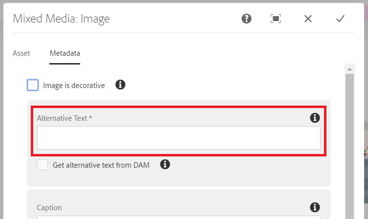
2. Fill out the dialogue box as prompted. Please note the following areas on the dialogue box below.
Highlighted in red:
- Action Menu to maximize the dialogue box, cancel or save
- Tabs within the dialogue box, be sure to check these for additional options.
- Opens the selection dialogue box to find internal links

Note: Please remember to publish your changes after you are done editing so they can be visible to the public.
Component Usage by Page
A page in AEM is built using several components. To see how a page is constructed and the type of components each page uses, you can mouse over the components while on the page in edit mode.
Alternatively, you may use the Content Tree feature within AEM:
1. You must be in edit a page mode
2. Toggle the side panel by clicking on the button on the top left corner of the page (looks like a window icon)
3. Select the content tree icon to access the content tree section of AEM
4. Here is an example of components that make up a page

Adding Images to a Component
1. With the edit page open, click on the button on the top left corner of the page (looks like a window icon)
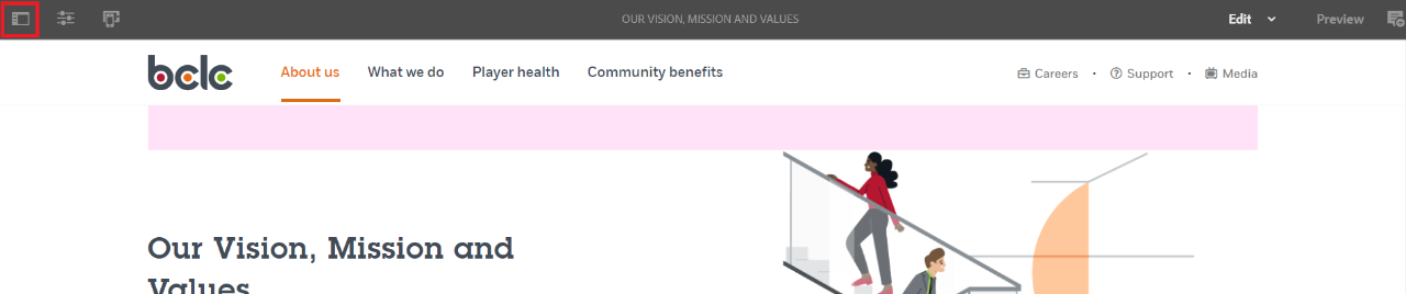
2. Select the Assets tab if it is not already selected (first icon on the side panel)
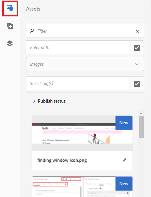
3. Click the check box under the search filter to open the Selection Dialog

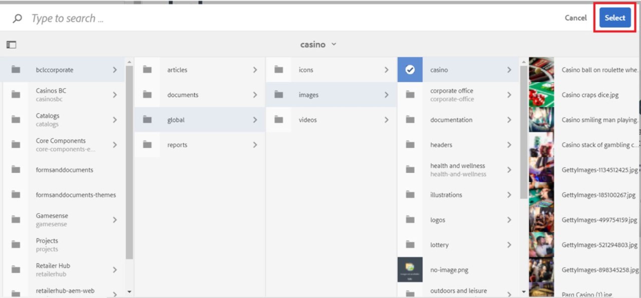
4. Search for the desired image by navigating through folders in the DAM. Make sure to go through bclccorporate > global > images for common assets, or bclccorporate > documents for all other images.
Refer here to see how these folders are organized.
Check the box of the folder that houses the image, and click Select in the top right corner. This should update the images you see in the asset tab.
Note: You may also use the search field in the asset tab or in the Selection Dialog to locate an image, but results may vary and are sometimes inconsistent.
5. Re-open the component configuration. Select the chosen image from the asset tab and drag and drop it into the configuration window.
Note: Remember to include an Image Alternative Text to describe the image. This is to provide accessibility to those using a screen reader, such as people with impaired. ‘Get alternative text from DAM' option will only work if the asset has a Description in the Properties (Metadata).
An example of this for our image below could be “Hand resting on slot machine”.