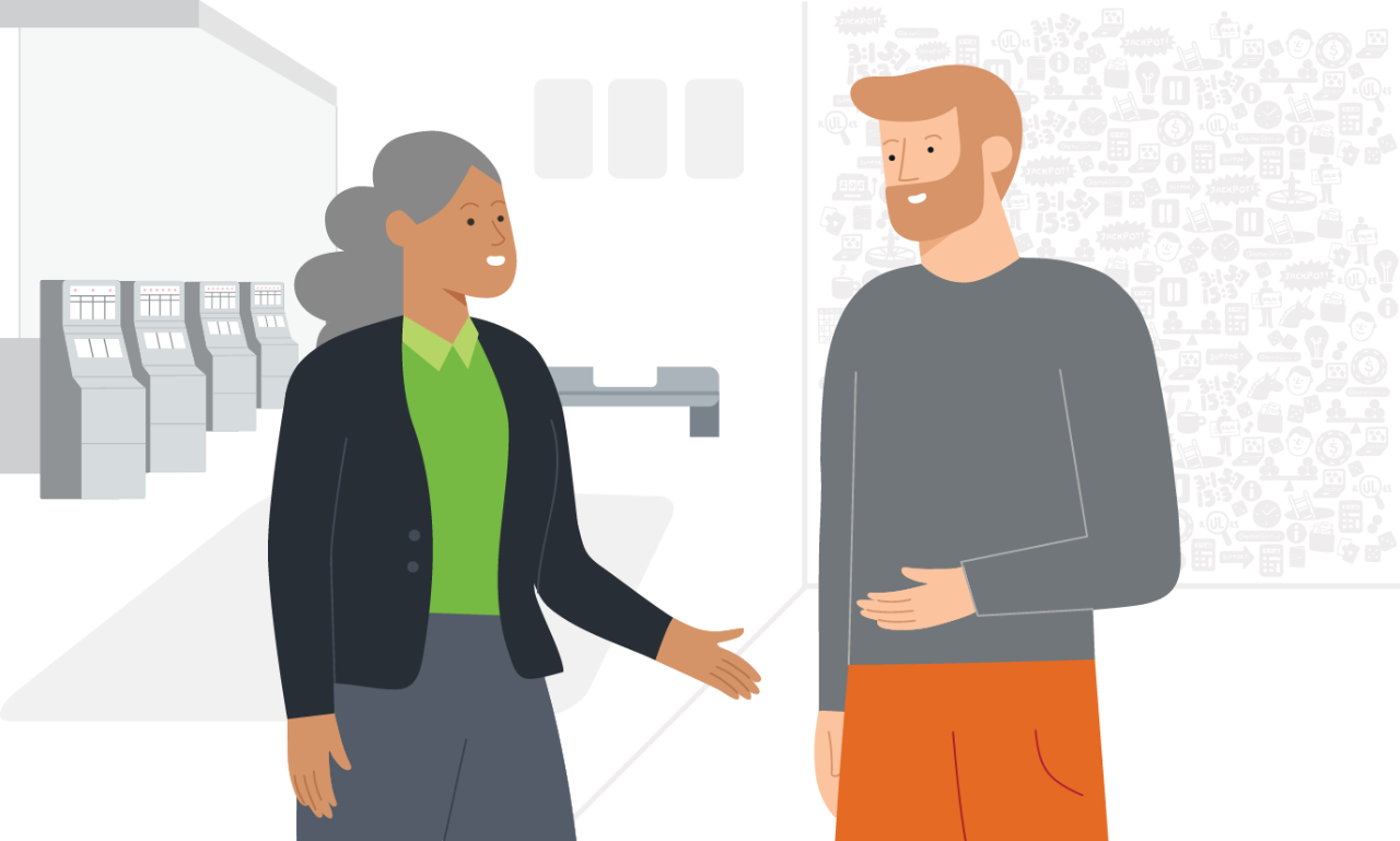
Header: Scaled (Subtitle)
This component provides a basic header and description that introduces a Level 2 page.
Title
Subtitle that tells you a bit more about this page. Subtitle that tells you a about this page. bit more abou
Title with no subtitle
Usage Criteria
This component provides a basic header and subtitle that introduces an L2 page and its contents. Page hierarchy ranges from L1 (highest level) to L5 (lowest level). Please see the Design Notes below for more information.
Do's and Don'ts
- Do not use this component anywhere other than the top of a page (after the global navigation).
- Do not use this component more than once per page.
Design Notes
If the description is too long for the component, consider breaking it up and displaying it as part of the page body content below.
A note on page hierarchy: L1 pages are the surface level pages that users can easily access and usually serve as funnels to go deeper into other pages on the website. As the pages get deeper, they are defined by lower levels.
An example of this is the Media Overview page (L1). From here, you can go deeper into News Releases (L2), which is also a part of the media section but a level lower because of the path that is taken to get to the page on the site.
Configurable Options
This component has basic configurations for the Title and an optional Subtitle. All text will be automatically left aligned. If no description is entered, the title will vertically center on the header.
Developer Notes
Type |
Name |
|---|---|
AEM Component Name |
Header: Scaled (Subtitle) |
Code Base Name |
header-4060 |
resourceSupertype |
bclccorporate/components/content/base-textimage |
SCSS Attributes |
|
JavaScript |
|
Status |
Released (RC 1) |
Version |
Code Base v1.0 |
Designer Notes
Type |
Name |
|---|---|
Sketch Component Name |
BCLC_Corporate_Designs/components/header/scaled-subtitle |
Sketch Responsive Sizes |
Desktop HD, Desktop, Tablet, Mobile |
Status |
Released (Master) |
Version |
Design 1.0 |

